I wanted a home for client work that felt more like a studio than a personal GitHub profile.
Program Edge is a consulting and build studio — custom websites, AI-assisted product work, and the program management depth to help both actually ship. I built it across two sessions with an AI agent in Cursor: brand identity first, then five pages, deploy verification, and a palette refresh — all live on Cloudflare Pages before the second session ended.
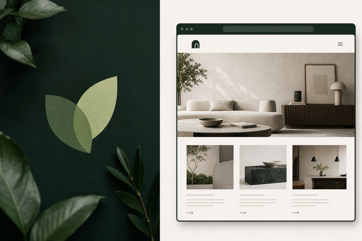
The detail I’m happiest about is a small one: the homepage doesn’t show a screenshot of the client site. It embeds it live.
A brand grounded in research, not just preference
The logo and palette didn’t come from “what looks nice today.” They came from research we could point to later:
- Shape psychology: rounded forms read warmth; overlapping shapes suggest collaboration; angular structure reads trust
- Color: I preferred green over the safer teal option; emerald kept teal’s depth while fitting an organic leaf mark
- A happy accident: two converging leaves formed a “V” — collaboration, growth, and a personal touch in one mark
We captured decisions in a BRAND.md file: palette, tagline candidates, logo variants, and a collaboration pillar. Later pages pulled from that source instead of reopening every debate.
Positioning settled on Building first, Consulting backed by depth — lead with the tangible offer, and differentiate on offering both.
For a new practice, we skipped a public rate card for now. Outcome packages, engagement models, and budget qualification on the contact form felt like a gentler starting point than publishing hourly rates before the practice had a track record.
Static HTML, one CSS file, and design tokens that pay off
Same pattern as the Center X client site: static HTML, shared styles.css, minimal vanilla JS. No build step. Mobile-first. Cloudflare Pages auto-deploys from main.
The palette refresh was where design tokens really earned their keep. Every dark section referenced --navy. Changing three CSS variables — and warming the on-dark neutrals — moved the entire site from navy to deep ink-green without touching each page individually.
Embed live, rather than screenshot
The homepage features Center X Equine Therapy in a browser-frame mockup with a real scrollable iframe of the deployed client site.
Why I liked the iframe approach:
- It stays current — when the client site updates, the portfolio updates with it
- It shows the build is deployed, not just designed
- It feels more honest than “I built this” copy alone
Before writing the markup, it’s worth checking whether the target site allows framing — a 401 or X-Frame-Options: DENY will block the embed. Center X had HTTP Basic Auth during early preview; once that came off, the iframe worked.
The blog section pulls from my public RSS feed with a small fetch + parse in vanilla JS — latest post with image, three recent titles. If the fetch fails, the static fallback stays in place. One small lesson: format RSS dates with timeZone: "UTC" or posts can read a day early in US timezones.
Being honest about what belongs in the portfolio
Not everything made it into the public site, and I think that’s okay.
A “Peptide” project turned out to be a private, authenticated app with dosing content — not something I could safely strip and show. Removing auth would have been both a security change and a reputational risk, so it stayed private and out of the portfolio. We talked through that openly rather than forcing a demo.
Same with a public LLM-backed demo agent: putting my API key on a public endpoint would create cost and abuse risk. That felt like a decision to flag, not make quietly. Existing real work (ToolWitness, the market-risk report) is honest proof without inventing something new.
The Work page tells the Center X story through two lenses — product (start-with-user, North Star, business objective) and program (discovery trail, dependencies, critical path). Both came from actual project notes, not invented case study language.
Deploy verification: trusting dig and curl over the dashboard badge
Cloudflare Pages showed “Verifying” on the apex domain with an “up to 48 hours” banner. Meanwhile dig and curl were already returning 200 with a valid cert.
A few go-live lessons:
- Cache-bust on a no-build static site. Without bundler hashes, stale
styles.csscan lie to you in the browser.?v=YYYYMMDDon asset links plus_headersrevalidate for HTML makes “did my change ship?” easier to answer. - Deploy is often two steps, not one. Adding the apex custom domain doesn’t automatically add
www— that’s a separate entry before_redirectswww→apex has anything to redirect. - Verify all five routes after push. “Committed” isn’t the same as “live.” I checked every page and grepped the deployed CSS for the new
--navy: #0f1e17to confirm the palette had actually shipped.
The contact form uses Web3Forms with accessibility labels, a honeypot, a budget dropdown, AJAX submit, and a no-JS fallback.
A loop I didn’t plan but liked
Center X credits Program Edge in the footer — “Site built by Program Edge” with a CTA to program-edge.com/contact.
Program Edge embeds Center X on the homepage.
Client work and studio marketing ended up reinforcing each other. That’s a model I’d like to keep: build something real for someone, it helps them, and it quietly becomes proof for the next conversation.
What I’d do differently
Handing off at ~87% context with a HANDOFF.md worked well — though I’d generate optimized screenshots earlier. Live embeds are better for the hero; case study cards still benefit from compressed JPEGs (sips on macOS turned a 3.5MB PNG into 160K JPEG).
For iCloud custom-domain email, we learned to skip “add existing addresses” (it sends verifications you can’t receive), verify via DNS instead, and keep Cloudflare Email Routing off so it doesn’t fight iCloud’s MX.
See the client build embedded on the homepage: program-edge.com. Read how we got there: Research Before Pixels.